I am having more than 10 years of experience in Information Technology. Currently working with ValueLabs as a Product Owner for Snapfish . Education - Project Management Professional (PMP) Certified, Certified Usability Analyst (CUA) from Human Factors International (Mumbai, India). prashant.poladia@gmail.com | +91-91600 55003 | www.PrashantPoladia.com
Thursday, April 27, 2006
Useful Threads of Flash by CyanBlue
This list has been provided by Jason Je known as CyanBlue. He is Certified Macromedia Flash MX Developer.
PS: Most of the stuff in those threads are based onFlash MX which might not work in Flash 8.
Tuesday, April 25, 2006
Heuristic Evaluation
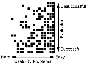
Heuristic evaluation is a discount usability engineering method for quick, cheap, and easy evaluation of a user interface design.
Heuristic evaluation is the most popular of the usability inspection methods. Heuristic evaluation is done as a systematic inspection of a user interface design for usability. The goal of heuristic evaluation is to find the usability problems in the design so that they can be attended to as part of an iterative design process. Heuristic evaluation involves having a small set of evaluators examine the interface and judge its compliance with recognized usability principles (the "heuristics").
Now, your immediate question would be... "How do i conduct the Huristic Evaluation?"... right?
So, Conduct a heuristic evaluation.
Monday, April 24, 2006
Prototyping

Prototyping is the process of quickly putting together a working model (a prototype) in order to test various aspects of the design, illustrate ideas or features and gather early user feedback. Prototyping is often treated as an integral part of the development process where it is believed to reduce project risk and cost.
Often one or more prototypes are made in a process of incremental development where each prototype is influenced by the performance of previous designs, in this way problems or deficiencies in design can be corrected. When the prototype is sufficiently refined and meets the functionality, robustness, manufacturability and other design goals, the product is ready for production.
Source : en.wikipedia.org
Wednesday, April 19, 2006
High Dynamic Range Imaging (HDRI)
For more info on it please visit Brajeshwar's Blog, where i have read about it.
Tuesday, April 18, 2006
Validate your webpage with W3C Validation Service
By keen i tried www.google.com and surprising the result was "48 errors" http://validator.w3.org/check?uri=http%3A%2F%2Fwww.google.com&charset=%28detect+automatically%29&doctype=Inline .....
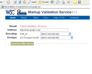 Well.... my website www.PrashantPoladia.com also has "51 errors" this is bad side of me.... but i will definately keep eye on this to change that to "100% ok" result.
And known sites which have passed through this test are:
Oinam (brajeshwar) and Microsoft
Check your sites too...... its interesting.
Monday, April 17, 2006
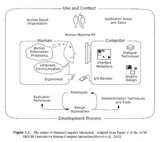
Nature of Human Computer Interaction
Do you know the LONGGGGGGGEST word in English?
Taumatawhakatangihangakoauauotamateaturipukakapik-imaungahoronukupokaiwhenuakitanatahu is the Maori (language) placename on an otherwise unremarkable hill which is 305 metres high, close to Porangahau, south of Waipukurau in southern Hawke's Bay, New Zealand.
The placename is often shortened to Taumata by the locals for ease of conversation.
The placename on the sign that marks this hill is spelt as Taumatawhakatangihangakoauauotamateaturipukakapikimaungahoro-nukupokaiwhenuakitanatahu which roughly translates into English as The brow [or summit] of the hill [or place], where Tamatea, the man with the big knees, who slid [down], climbed [up] and swallowed mountains, [to travel the land], [who is] known as the Land Eater, played [on] his [nose] flute to his loved one. At 85 letters, it is one of the longest placenames in the world. There are several alternative translations and variants in spelling.
It has also been spelled as: Tetaumatawhakatangihangakoauaotamateaurehaeaturipukapihim-aungahoronukupokaiwhenuaakitanarahu, which is 92 letters, and has been entered into the Guinness Book of Records as such.
The longer version of the name is apparently more recent, or perhaps more formal. There are claims that the longer name, which is now shown on a sign, has been in use all along by local Maori. The Welsh argue that the longer name has been contrived to be longer than Llanfairpwllgwyngyllgogerychwyrndrobwllllantysiliogogogoch, which some others argue was contrived to be the longest British place name in the first place.
Sunday, April 16, 2006
Young Indian Cricketers..... Rocks!!!
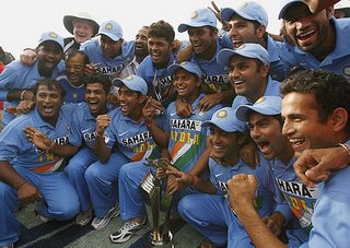
Yet another series victory mark for the Indians in their pockets. Although 6 key players of England did not played the series because of personal and health issues, but still, winner is a winner "JO JEETA WOHI SIKANDAR".
One of the important thing which came out from this series is the PERFORMANCE of the YOUNGSTERS, the power and commitment of NEW COMERS. They were looking confident and their performance was of THE BEST. Just few years ago Indian team was all depend on experince people like Sachin, Ganguly and Sehwag, but from today's match youngesters have shown that its no more like that...... we can still fight and win the match without the key players and its no more singles man's army..... its all about team work.
Anyways, still wants to see SACHIN, SEHWAG and KAIF to back in the team and i am sure if the our team keeps continue to have such a winning attitude... "Boss!!! World Cup won't go anywhere".
Thursday, April 13, 2006
Flash Information Visualization = Great User Experiences
This article was first published by User Interface Engineering in one of their e-mail newsletters. www.uie.com
--------------------------------------------------------------------------------
Giving users access to huge, multidimensional data sets has always been awkward and clumsy, until now. By combining the latest generation of tools, such as Flash, ActiveX, and Java, with the latest research from the little-known field of Information Visualization, we can provide user experiences that dramatically help users achieve their goals.
For instance, how would you design an interface to help find the ideal home in a database with thousands of listings? Until now, many designers opt for HTML, incorporating a mix of drop down lists and a keyword-based search tool to help users narrow down their choices.
HTML handles data clumsily and makes filtering results cumbersome. With keywords, designers have to know what words people will enter, including all the mistyped versions of those words. What if there are too many results? How does a design encourage a user to narrow down the homes, and identify criteria that are important to each specific user? If the results are too few, how does the design let users know what the scope of the database is? And how many times are users willing to recast their search?
Users may struggle to get at a reasonably narrow dataset, and fail to get insight into what the data is telling them. They fail to find a home that best meets their criteria, even though that home may well exist within the database.
It’s a frustrating experience both for the designer and for the user. Fortunately, there’s a little-known group of researchers that have been studying these problems for a long time: their field is called information visualization, and it provides very promising solutions for how to manipulate and display massive amounts of data.
To see examples of how information visualization can help, we need to look no farther than the work of Ben Shneiderman and his fellow researchers at the Human Computer Interaction Lab at University of Maryland. Ben founded HCIL in 1983 and they have done incredible research in this field, including dynamic queries, fisheye menus, and zoomable user interfaces.
For example, dynamic queries allow users to ask “what if” with their data and get an immediate response. It single-handedly resolves most of the problems with traditional database query methods using HTML.
Ben's team developed a technique known as starfields, which formed the basis of a product called Spotfire, which uses dynamic queries as its foundation. If a user were to find the ideal home using Spotfire, the process might go something like this: Beyond number of baths and bedrooms, users may want to decide on a home using sophisticated variables, like how close the house is to where they work, how land value has changed over the past 20 years, and the house's distance from public parks and shopping areas.
A user might start with some portion of that data, seeing it displayed in a two-dimensional space as a scatter plot. Then, much like a slide rule, she could adjust the ranges of several variables by sliding the pointer for the minimum and maximum ranges. Instantly the data would change to reflect her new ranges.
As well, some data could be viewed using size and color. If the user wants to look at homes within 30 miles of work for her and her spouse, homes that are 10-20 miles away might be labeled with a yellow square, with homes more than 20-30 miles away as green squares. Another variable — square footage of the house — might be visualized by the relative size of each square, the biggest homes being the biggest squares.
Eventually, through a process of taking big pictures of specific variables and narrowing the scope, a user might arrive at a small data set of homes that best fit her criteria, evaluation each of those in detail.
What makes the field of information visualization exciting for today's designers is the advent of graphical development tools like Flash, Active X, and Java. These tools can help utilize the latest advances of information visualization. Using them, developers can create interactive applications that deliver instantaneous responses to complex queries of large data sets.
Sophisticated tools that work like Spotfire are still uncommon on the web. But some simple implementations of these concepts are available today. One modest, but effective implementation is the used car section at http://www.cars.com/. It is a simple direct query interface for quickly finding the best used cars. Like Spotfire, it uses sliders to display the cars available according to the customer’s specifications
For example, to narrow the age of a car to just four years old or newer, with a click of the mouse you can slide a marker along the Year bar until it reaches 1997. Instantly, the number of results changes from 102 to 86 cars. No hitting submit and waiting for pages to download. Using the Price bar, you can quickly see that there are no Grand Ams at $14,000, so you slide the minimum price marker to $12,000, and the maximum price marker to $16,000, and by the time you let go of the mouse, the system tells you that there are 33 cars within this range.
There’s a similar implementation at http://www.bluenile.com/ to build your own ring.
We're already seeing designers integrating the world of information visualization into their work. Another research contribution, the hyperbolic tree browser by Ramana Rao at Xerox PARC, is now commercially available. (To see a tree browser in action, check out http://www.inxight.com/.) To see a treemap of stockmarket data visit www.smartmoney.com/marketmap.
We think that the exciting research that Ben Shneiderman, Ramana Rao, and many others have done is finally going to make it mainstream in the next few years. This will dramatically enhance the user experience when dealing with large, complex information spaces. •
Prash
TG GOOGLE BROWSER
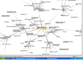
Wow this is an amazing stuff that i just got in touch with http://www.touchgraph.com/TGGoogleBrowser.html
Check out by yourself, just type in your website URL and you can check with whom you are linked up and many more details.
Must see it!!!
Prash
Wednesday, April 12, 2006
copy paste between 2 computers?
This is the interesting stuff which i read on my friend's blog site (keith).
"Ever been on two computers at the same time and have to copy text from one to another, use a messenger right that's the easiest. If you use an Remote Desktop then it starts to get a bit painful, well don't worry there is a solution for that now thank's to another good tip from Lifehacker.
Well you can read the article about copying and pasting between computers at Lifehacker. "
One more way is to use Google mail and save it as a draft. :)
Cheers,
Prash
Monday, April 10, 2006
What is a user interface?
Like any good communication channel, a user interface is a two-way street. You don't want to just see or hear whatever the computer puts in front of you, you also want to tell it what you'd like to do. For instance, to get to this web page, you "asked" your computer to show you pages on a certain subject. You may have used a mouse to point and click on a button or word, or maybe you spoke instructions to the computer. However you express it, everything you tell the computer is input; what it conveys to you is output. The ways you can receive output and give input depend entirely on the user interface.
The best user interfaces are the ones you don't have to pay much attention to. They make sense to you and do what you expect them to. When an interface is easy to use, you can spend your time doing your work instead of looking everywhere for the right button or key to press. It's almost transparent--you can see right through the interface to your own work.
[source-IBM]
Friday, April 07, 2006
Usability Experts are in Demand!!!
This is my 1st blog, so guys, pls excuse me if i type/say anything wrong :) here.
Yesterday, met Aadesh Mistry (accidentally) at Churchgate Station in train when i was returning my way back to home. Well, i met him after a long time and it was pleasure meeting him, though he was busy with his personal SMSs (won't mind Aadesh). Aadesh is working in TCS as Usability Interface Expert and doing a course of Human Computer Interaction.
I feel really happy to know that more people are getting into User Interface fields and the demand for such a profile is also now in focus. It's great to know that people are trying to deliver what end user would be more comfortable in using it.
I am hoping to see a Degree Course on HCI (Human Computer Interaction) in India.
Thanks,
Keep Bloging,
Prash [www.PrashantPoladia.com]
